The shift in commerce to online platforms, plus smartphone taken-up has driven a whole new approach to how we’re interacting with devices, whether that’s your phone, tablet or computer. Ease of use, even on the smallest phone is a must as consumers shift away from bricks and mortar shopping, to online. The importance of slick easy-to-use user interfaces (UI) could make a real difference in the success of digital commerce.
The importance of mobile first UI design and touch interface principles
The balance of power has shifted dramatically away from desktop devices to mobile, making the role of the user interface design even more important and challenging for designers and developers alike. Screen sizes on phones have been on the up, which does help increase the screen real-estate to play with. There has to be a limit to phone sizes though; we don’t all have supersized deep pockets!

It’s not only screen space issues that need to be thought through. Touch interface has to be much more space generous. Human fingers and thumbs demand larger tap areas, unlike mouse-driven cursor interfaces. This makes the economical use of the premium space a must. Simplification has to be a priority in any design; not easy if you’re trying to give as much information as possible to the end user and also trying to please Google with search engine friendly copy for it to index.
Menu design – how to drive interactions, navigation, and understanding
The mega menu still reigns supreme on retail desktop websites, the ability to show and select numerous options on a single screen is second to none. Anyone with a large product portfolio should consider using mega menus if they’re not doing so already.
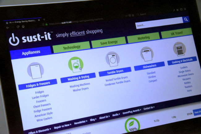
The selection of the submenus should easy, with clearly defined live areas (clickable/tap areas). Heading spacing needs to be generous for tablet device user — this benefits readability too.
The categorisation of product lines within your menu system is key to assisting users journey through any site. The wording, language, and terminology used should reflect users’ expectations, rather than how you as a business refer to your products or services. Think about how your client or customer looking for a specific product or service might think! Keep wording short – menus are pointers, not full descriptions. Simplicity isn’t simple; take your time constructing the words and structure for your menus.
Images and icons within menus can be used to good effect, speeding up recognition, without needing to read a thing. Any visuals you choose should reflect your brand, and be bespoke if budgets allow. As with all design, the colourways should be complementary to your corporate look, call to action buttons, links signposting should be defined and consistent.
Mobile first menu UI design, hamburgers or is there a vegetarian option?
The Smartphone user is now outnumbering both desktops and tablet users. The challenge with a mobile user is getting them to the right section of your site before they swipe elsewhere. Keeping mobile users’ session duration as long possible is a factor in how search engines rank your website; and potentially whether you generate sales.
The default for many mobile interfaces is the Hamburger menu. Introduced in the early days of Graphical Interface Design (GUI) in the 1980s. It has had a revival since Apple, Facebook and Google started using this graphical device on the first-generation smartphone apps.
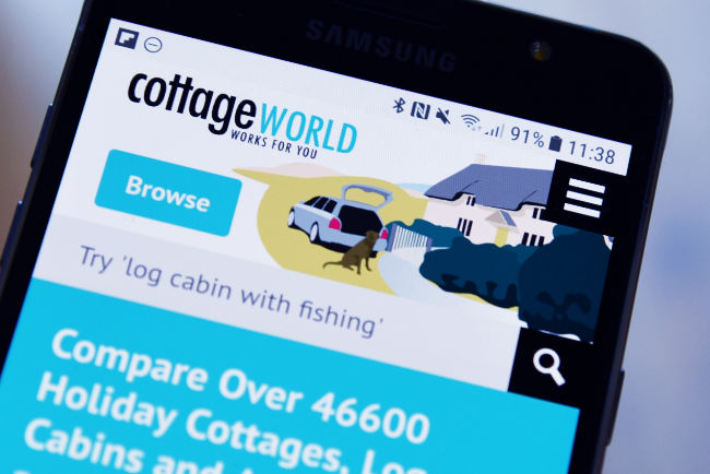
Hiding information behind layers of screens, or menu devices such as hamburger icons can help. However, this can be counter-productive as it can be easily missed or misunderstood. Having to tap through endless submenus is tedious. ‘Three clicks from anywhere’ used to be the old desktop website mantra – difficult in our smartphone world!
Other options include tabbed interfaces, these are a good option if space permits and should be named with single words, or better still utilising nicely designed, easy to recognise icons. Swipeable menus offer another way of interacting, working with images or graphics, offering a very quick option for driving mobile users to other content within your site. I’m a great believer in tappable images and photographs, we’re becoming pre-programmed to just tap on stuff, and expect it to zoom up, or take us elsewhere.
Logins, form filling and checkouts
The trick is to keep things simple, break tasks down into manageable step-by-step chunks. E-commerce apps need to signpost users to where they are within the process. Any errors, such as an incorrectly inputted email address, should be clearly highlighted and coded to prevent the user from going any further.
Keeping your interaction within reach and consistent
Fortunately, our thumbs aren’t growing at the same rate as our smartphone screens. For most people, gone are the days of driving a smartphone single-handed with your thumb! With phones reaching tablet dimensions it’s worth factoring in the areas that your thumbs can reach and position the buttons accordingly. Think about the prime place for frequent navigation hotspots – hamburger menus usually sit top left or right. That said, breaking the norms of user expectations is what designing new products is all about. Rules are there to be broken, otherwise, nothing moves on!
Hope the above proves useful. There are loads more to be covered on this topic in future posts. Please get in touch if you need further help or advice. All the best, Ross


